October 19, 2021
If the hue fits: Find the floor that matches your favorite period of art history
by Haley Holm-Pedersen
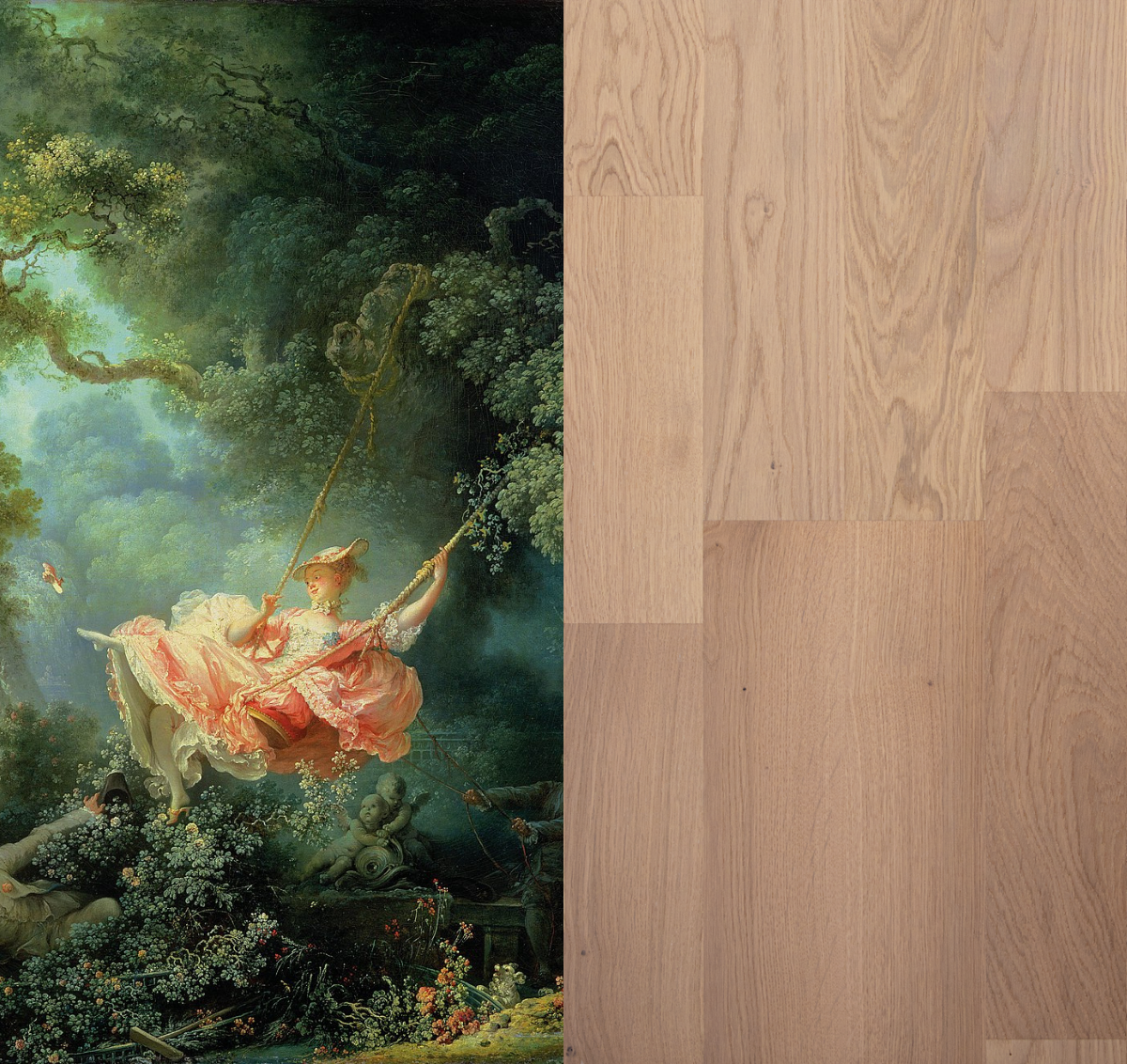
Rococo
Rococo era paintings used dreamy pastel colors to depict ornate, often lighthearted and flirtatious scenes.The Swing by Jean-Honoré Fragonard shows the leisurely subject matter and soft color palette often found in Rococo art.
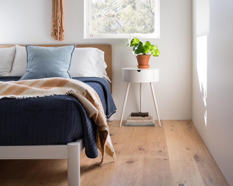
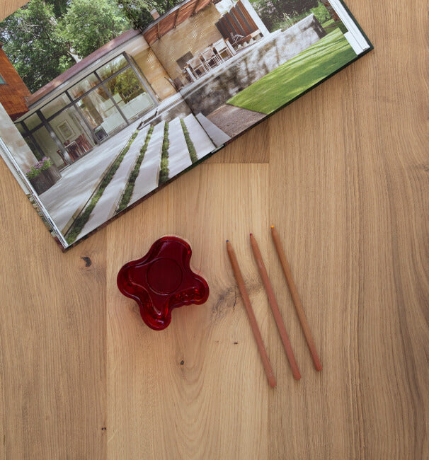
Parkday, named for one of Sweden’s favorite laid-back pastimes, has the soft tones that you might find on the brush of a Rococo painter. Greta’s light color and soft texture is perfect for complementing pastel tones, making it another great choice for fans of the Rococo style.
Impressionism
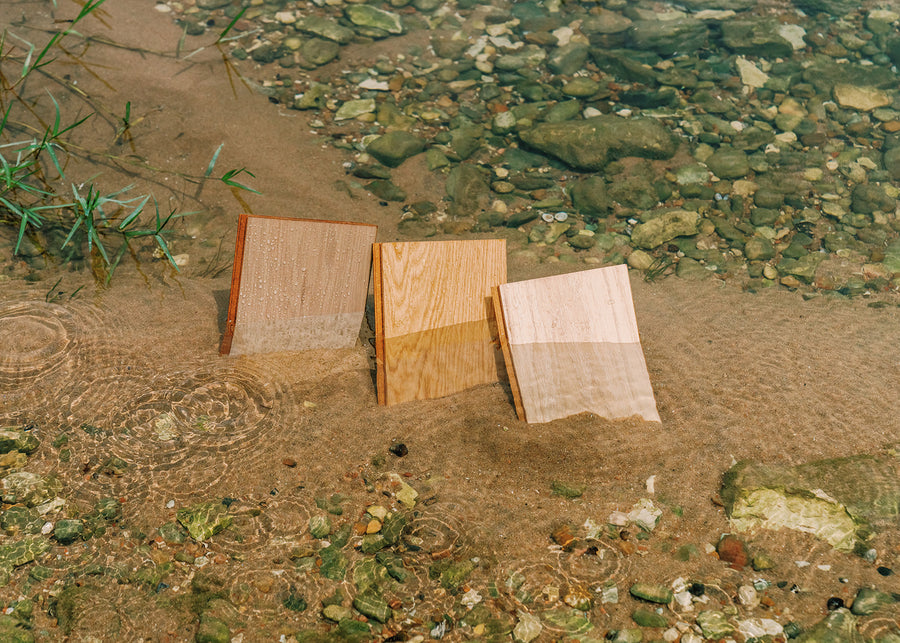
Artists like Mary Cassatt and Claude Monet brought Impressionism to the world through their art in the 19th century. Painterly brush strokes, soft colors, and an emphasis on depicting light characterized the movement. If you love Impressionism, Shell's soft tones and beautiful texture might speak to you.
Art Nouveau
Art Nouveau posters were graphic in style and often featured captivating, feminine subjects. Artists like Alphonse Mucha created floral, curvilinear scenes that, combined with Art Nouveau architecture and interior design, reflected the extravagant style of the turn of the 19th century. Moonlight shares the same silvery stain that picks up the airy tone of the Art Nouveau movement.
Bauhaus
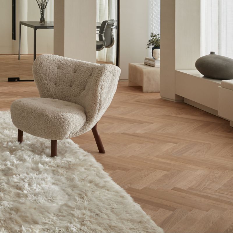
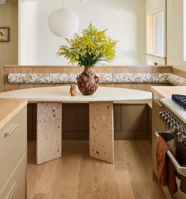
The Bauhaus school was incredibly impactful in the world of design. Merging function and aesthetics was a fundamental principle of the school. Simple, geometric shapes characterized much of the art and architecture influenced by Bauhaus. Fika and Little Square share a nearly identical neutral stain that make them two of the most versatile floors in our collection. They are the perfect blend of practicality and beauty, much like Bauhaus design.
Surrealism
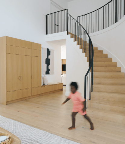
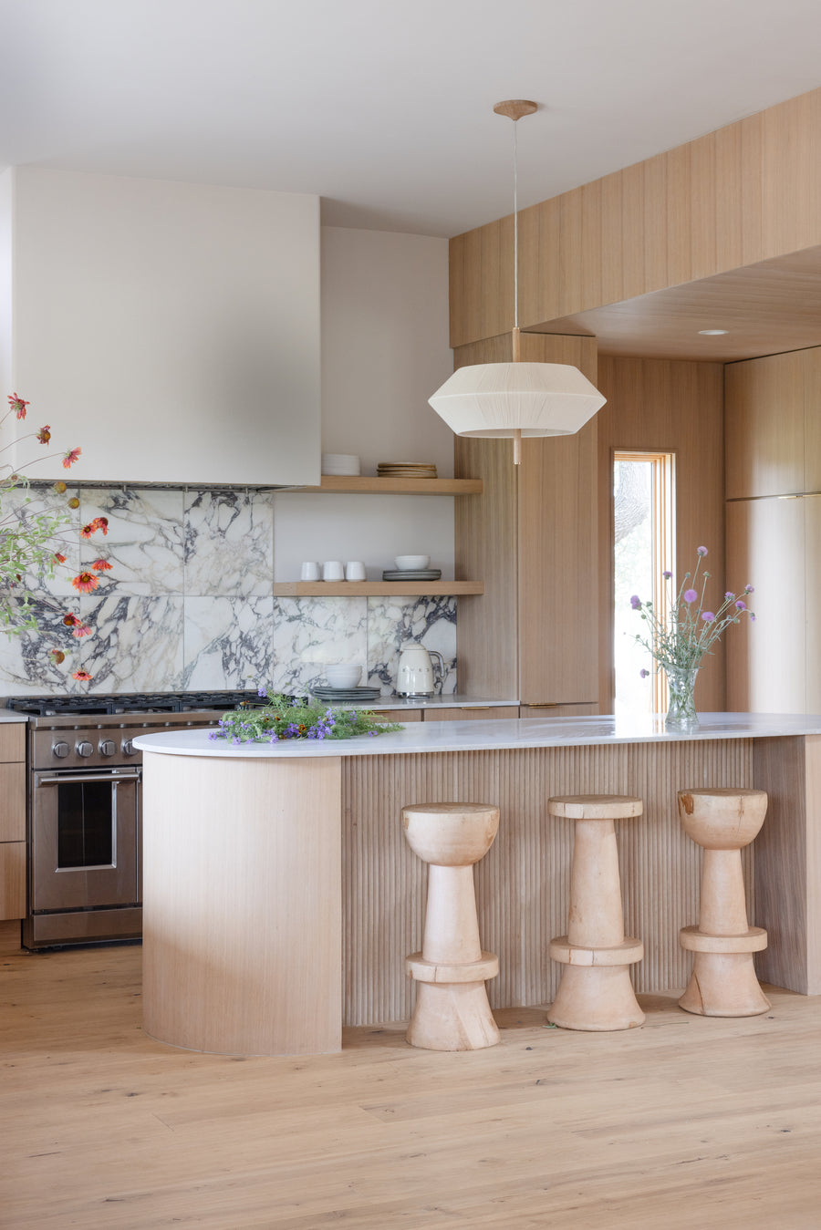
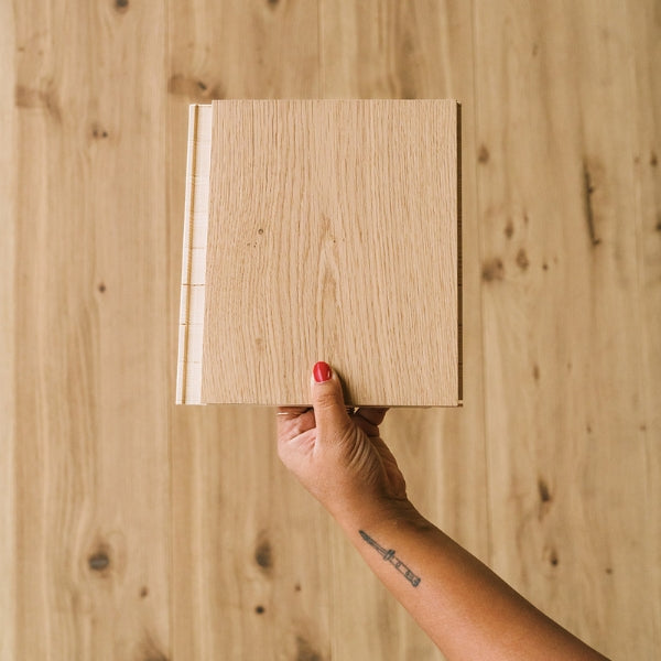
Artists like Salvador Dali and René Magritte enjoyed taking ordinary things and flipping them on their heads with surrealism. Louisiana can be considered classic; after all, unstained oak floors have been in style for hundreds of years. But their innovative use of multiple boards to each plank is efficient - it allows much more of each tree to be put to use - and beautiful.
Post-Impressionism
Post-impressionism took the work of artists like Monet and further explored it. The painterly brush strokes and interest in light found in a Monet scene were amplified in works by post-impressionist painters like Paul Cézanne and Vincent Van Gogh, who used a heavier hand and bolder colors.
Harbor is a smoked floor, giving it a natural variation between darker tones and warm, midtone brown. Its bold color and unique expression is why it’s a favorite of ours here at Stuga, and why it reminds us of post-impressionist colors.
Cubism
Pablo Picasso made a huge impact on the art world with his cubist paintings. If you love Picasso’s heavy use of contrast, you might like Pepper. One of our most character-filled floors, Pepper features dramatic, black cracks on its otherwise light and bright surface. Forest is another floor bursting with character - with smaller knots that take after the detail-work and patterns found in Picasso’s paintings.
